SKAGEN
Nordic Sky Series Brand Visual
Translating the majestic Nordic landscape into a visual identity that embodies SKAGEN's Danish design spirit
INSIGHT
In 2005, SKAGEN entered Taiwan through a local distributor, launching exclusively through Eslite bookstore channels — a first for a Danish watch brand in Taiwan. The challenge was making consumers immediately grasp a brand they had no prior knowledge of, and understand its core design philosophy: the founder's practice of infusing uniquely Nordic landscape colors and scenery directly into each watch face design.
STRATEGY
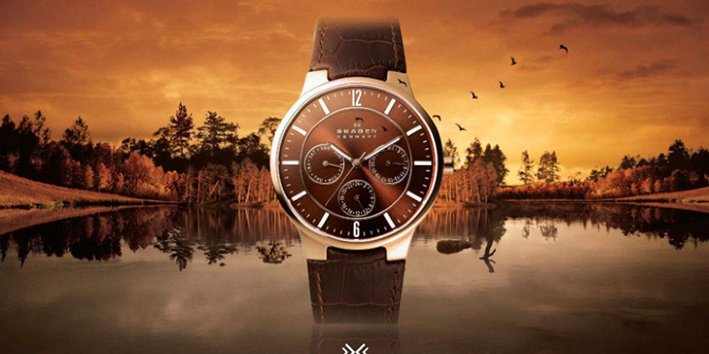
Let the advertising visuals directly show consumers where SKAGEN's watch face designs come from. JCW translated the founder's practice of embedding Nordic landscape colors into watch faces into a visual language: compositing dense Nordic landscape photographs into the 'Nordic Sky' KV series, so consumers could read the character of Nordic scenery and its unique ethnic color palette within seconds — and immediately understand why the watches look the way they do.
EXECUTION
Core KV development: compositing dozens of Nordic landscape photographs — eternal sunset horizons, fjord seascapes, forests, and polar light — into five 'Nordic Sky' series KVs. Each image naturally embedded the product within the Nordic landscape, unifying watch face colors with the advertising world around them. Selected by Eslite as the primary visual system for the brand's Taiwan market entry.
Performance Metrics
Launch Year
2005 年
Launch Channel
誠品書店
KV Series
北歐天色 5 張
Technique
地景圖像合成
The Brand Challenge
In 2005, SKAGEN entered Taiwan through a local distributor, launching exclusively through Eslite — a first for a Danish watch brand in Taiwan. The challenge: Taiwan consumers had zero prior knowledge of the brand. The brief required making them immediately grasp SKAGEN’s core design philosophy — that the founder embedded uniquely Nordic landscape colors and scenery directly into each watch face, making every dial a miniature Nordic landscape painting.
Strategy: Let the Ad Show Where the Design Comes From
JCW translated the founder's design patent — infusing Nordic mountain and sea landscape colors into watch faces — directly into visual language. By compositing dense Nordic landscape photographs into the 'Nordic Sky' KV series, consumers could read the distinct color character and landscape features of Nordic culture within seconds of seeing the ad, and intuitively understand why the watch faces look the way they do.
Creative Execution
Core KV development for the Eslite launch: compositing dozens of Nordic landscape photographs — eternal sunset horizons, fjord seascapes, forests, and polar light — into the 'Nordic Sky' series. Each image naturally embedded the product within its Nordic landscape, unifying watch face colors with the surrounding visual world. Adopted by Eslite as the primary brand entry vehicle for the Taiwan market.
Strategic Outcomes
The Nordic Sky KV series successfully established SKAGEN's first impression in the Taiwan market, conveying design aesthetics and brand philosophy simultaneously. The case demonstrates a fundamental creative principle: when a brand's core design concept is itself the story, advertising's job is to make consumers see it — not explain it.